
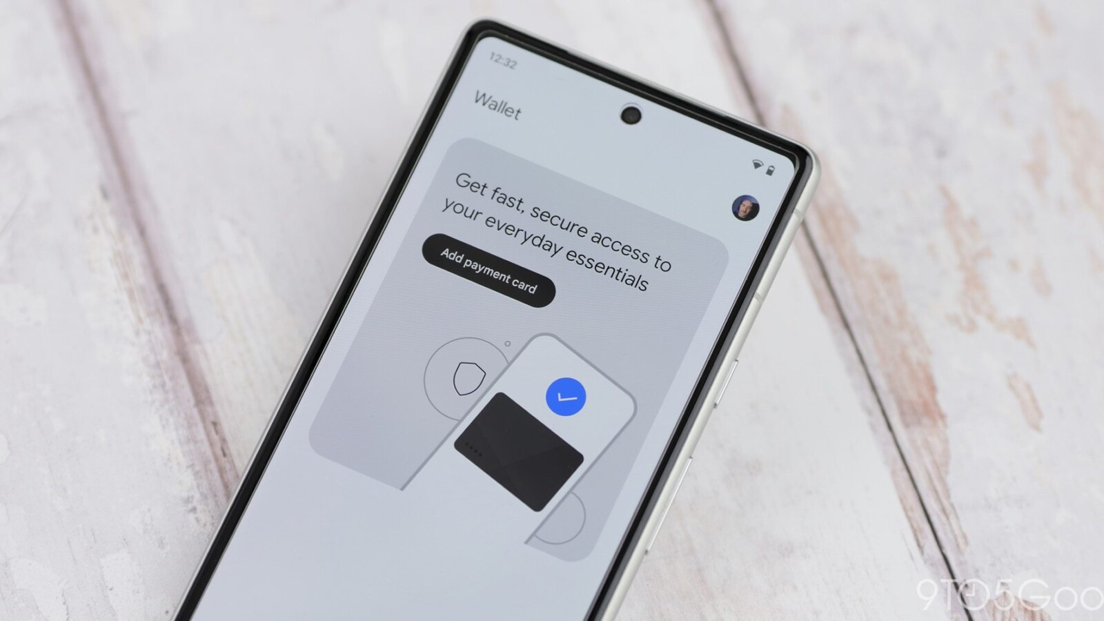
Google Wallet is rolling out a fullscreen redesign of passes on Android, following the earlier homepage revamp that introduced search functionality in May.
Rather than displaying a small rectangular card set against the Dynamic Color background, passes in Google Wallet now occupy the entire screen. The change also extends theming across the whole background of the page, using the brand’s primary colour to create a more immersive look.
What the new layout offers
Scrolling down within a pass reveals key actions, including the ability to call associated phone numbers and visit the official website. Under the “Settings” section, users can edit the nickname and control how it is used. These preferences were previously tucked away within the three-dot overflow menu, making them less accessible than they are under the updated layout.
The redesign applies to all loyalty cards and boarding passes, including those created manually. Transit cards, however, continue to use the older design for now.
Switching between old and new
A notable detail of the update is that it retains access to the previous appearance. Tapping the rewind icon in the top-right corner brings back the old look in its entirety, giving users the option to revert should they prefer the earlier presentation.
Visually, the fullscreen approach delivers a more polished experience. Some backgrounds can appear quite bright, particularly when passes are used at night, given that the theming now spans the full page.
As of today, the redesign is being widely rolled out across Android devices. The update sits alongside other recent additions to the platform, including built-in order tracking with Gmail on Android and the display of Wear OS payment history on Android phones. Google Wallet also recently added its 11th digital state ID, marking the first such addition in ten months.
Source
Image: 9to5google.com