
Google is reportedly working on a new user interface for the Play Store, with the change focused specifically on paid applications. The reworked design is intended to help paid apps and games stand out from the free titles that currently share an identical layout on the Android app storefront.
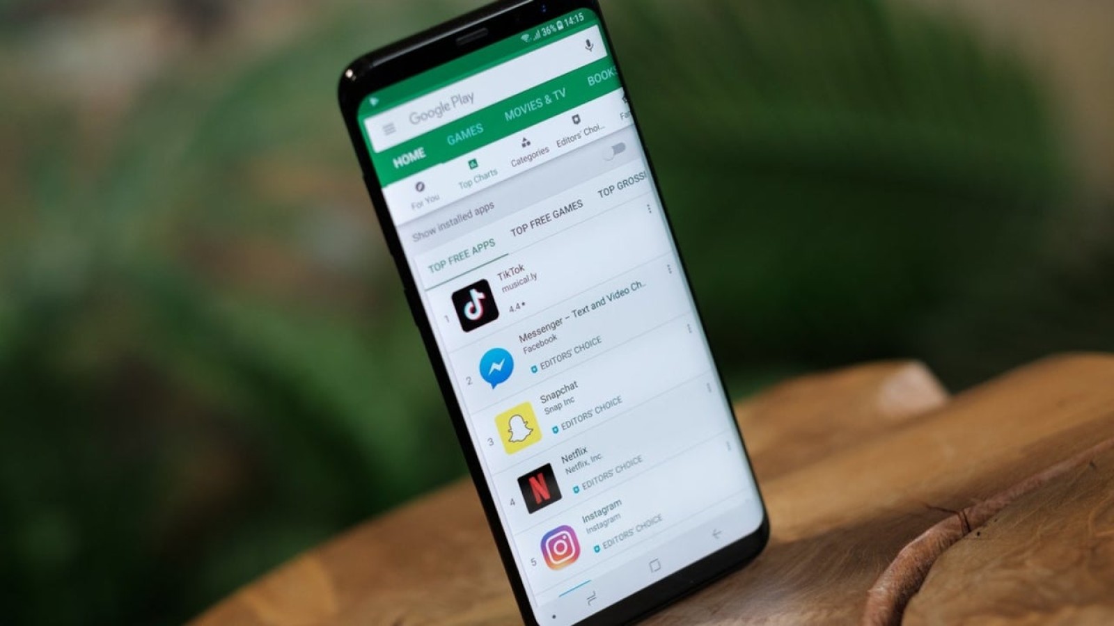
The updated look was spotted within version 53 of the Play Store. At present, both free and paid apps use the same UI, meaning users must read through the listing to understand exactly what type of app they are about to install on their Android device.
What changes in the new paid app listing
The new listing places a larger, more immersive image from the game at the top of the page. The background has also been switched from white to black. This darker design blends more smoothly with the phone’s status bar, the bar at the top of the display showing battery life, signal strength, the Wi-Fi icon, the time and the name of the wireless provider.
In the current version of a paid app listing, which looks just like a free app listing, the status bar does not integrate neatly and the effect can appear jarring. The new approach resolves this by merging the top of the immersive image with the status bar, creating a more cohesive appearance.
Missing details in the current design
The reworked layout is not without shortcomings. The new paid app listing does not display the number of installs for the app, nor does it show the app’s file size. Both details are present in existing listings, and their absence suggests the design remains a work in progress. It is possible this information will be added to the final version.
It remains unclear when, or even if, Google intends to release the new interface. Further changes could be made before any wider rollout, meaning the design seen in version 53 may not represent the final result. The stated goal is to differentiate free apps from paid ones more clearly within the Android app storefront.
For now, the update is limited to how paid apps are presented and does not affect the broader structure of the Play Store. The immersive imagery and darker background form the core of the redesign, aimed at making paid content more visually distinct across Android devices.
Source
Image: phonearena.com